
CanvasXpress 制作交互式图片
如题记录使用 CanvasXpress 中的一点理解,若未下载示例数据,只需要将 ./data/ 中的 . 替换成 https://www.canvasxpress.org 即可运行下面代码。
1.安装
devtools::install_github('neuhausi/canvasXpress')
2.使用
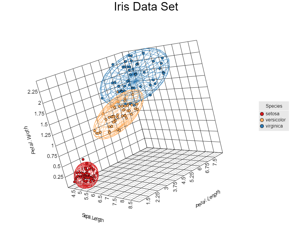
2.1 散点图-3D
y <- read.table("./data/cX-irist-dat.txt", header=TRUE, sep="\t",
                quote="", row.names=1, fill=TRUE, check.names=FALSE, stringsAsFactors=FALSE)
z <- read.table("./data/cX-irist-var.txt", header=TRUE, sep= "\t",
                quote="", row.names=1, fill=TRUE, check.names=FALSE, stringsAsFactors=FALSE)

canvasXpress(data      = y,
             varAnnot  = z, # 行注释

             graphType ="Scatter3D", # 图形类型

             colorBy   = "Species", # 颜色

             ellipseBy = "Species", # 置信圈

             xAxis     = list("Sepal.Length"),
             yAxis     = list("Petal.Width"),
             zAxis     = list("Petal.Length"),
             theme     = "CanvasXpress",
             title     = "Iris Data Set",
             axisTickScaleFontFactor  = 0.5, # 坐标轴刻度字体大小

             axisTitleScaleFontFactor = 0.5) # 坐标轴标题字体大小
2.2 散点图-2D
rm(list = ls())
y <- read.table("./data/cX-irist-dat.txt", header=TRUE, sep="\t",
                quote="", row.names=1, fill=TRUE, check.names=FALSE, stringsAsFactors=FALSE)
z <- read.table("./data/cX-irist-var.txt", header=TRUE, sep= "\t",
                quote="", row.names=1, fill=TRUE, check.names=FALSE, stringsAsFactors=FALSE)

canvasXpress(data              = y,
             varAnnot          = z,
             graphType         = "Scatter2D",
             colorBy           = "Species",
             layoutAdjust      = TRUE,
             scatterPlotMatrix = TRUE, # 图矩阵

             # scatterPlotMatrix = FALSE,

             width             = 1000,
             height            = 800,
             theme             = "CanvasXpress")
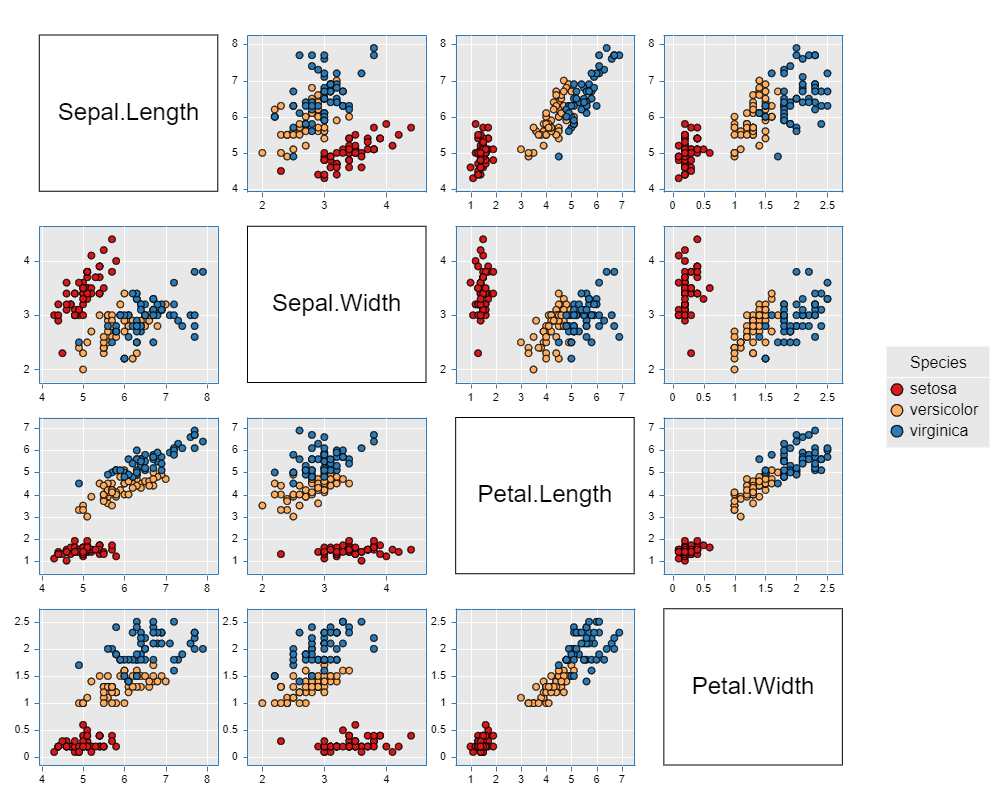
由于给定数据集中有 4 个变量,所以两两做二维散点图总共有 9 种。这是由 scatterPlotMatrix 参数来决定的,若将改参数修改为 FALSE ,则选择前两个变量来画一个二维散点图。
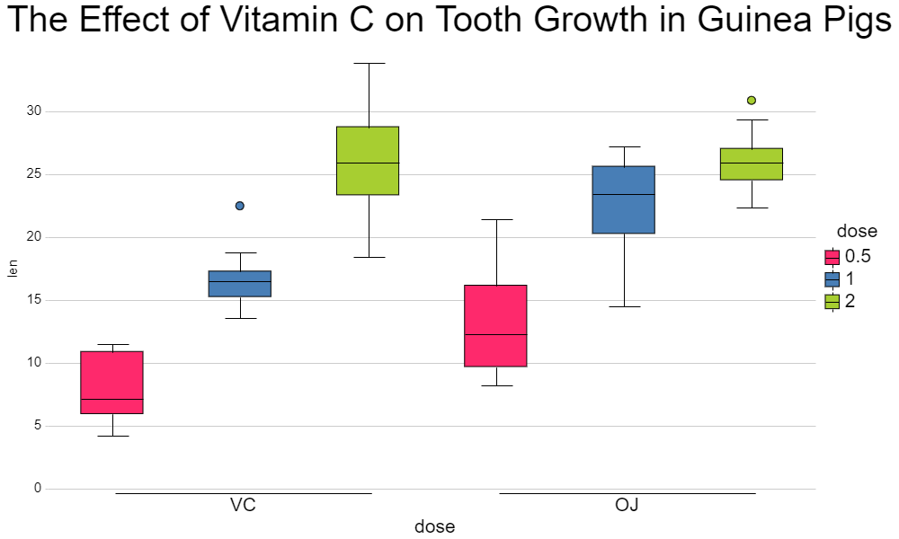
2.3 箱线图
rm(list = ls())
y <- read.table("./data/cX-toothgrowth-dat.txt", header=TRUE, sep="\t",
                quote="", row.names=1, fill=TRUE, check.names=FALSE, stringsAsFactors=FALSE)
x <- read.table("./data/cX-toothgrowth-smp.txt", header=TRUE, sep="\t",
                quote="", row.names=1, fill=TRUE, check.names=FALSE, stringsAsFactors=FALSE)

canvasXpress(data                  = y,
             smpAnnot              = x, # 列注释

             graphType             = "Boxplot",
             groupingFactors       = list("dose", "supp"), # 分组因子

             stringSampleFactors   = list("dose"), # 字符串化样本因子

             graphOrientation      = "vertical", # 图形方向

             colorBy               = "dose",
             title                 = "The Effect of Vitamin C on Tooth Growth in Guinea Pigs",
             smpTitle              = "dose", # 样本标题

             xAxisTitle            = "len", # x轴标题

             smpLabelRotate        = 90, # 样本标题角度

             xAxisMinorTicks       = FALSE, # 不显示x轴最小等高线

             xAxis2Show            = FALSE, # 不显示x轴2边的坐标

             width                 = 1000,
             height                = 600,
             legendScaleFontFactor = 1.8) # legend字体大小
2.4 热图
rm(list = ls())
y  <- read.table("./data/cX-multidimensionalheatmap-dat.txt", header=TRUE, sep="\t",
                 quote="", row.names=1, fill=TRUE, check.names=FALSE, stringsAsFactors=FALSE)
y2 <- read.table("./data/cX-multidimensionalheatmap-dat2.txt", header=TRUE, sep="\t",
                 quote="", row.names=1, fill=TRUE, check.names=FALSE, stringsAsFactors=FALSE)
y3 <- read.table("./data/cX-multidimensionalheatmap-dat3.txt", header=TRUE, sep="\t",
                 quote="", row.names=1, fill=TRUE, check.names=FALSE, stringsAsFactors=FALSE)
y4 <- read.table("./data/cX-multidimensionalheatmap-dat4.txt", header=TRUE, sep="\t",
                 quote="", row.names=1, fill=TRUE, check.names=FALSE, stringsAsFactors=FALSE)
x  <- read.table("./data/cX-multidimensionalheatmap-smp.txt", header=TRUE, sep= "\t",
                 quote="", row.names=1, fill=TRUE, check.names=FALSE, stringsAsFactors=FALSE)
z  <- read.table("./data/cX-multidimensionalheatmap-var.txt", header=TRUE, sep= "\t",
                 quote="", row.names=1, fill=TRUE, check.names=FALSE, stringsAsFactors=FALSE)

canvasXpress(data                 = list(y = y, data2 = y2, data3 = y3, data4 = y4),
             smpAnnot             = x,
             varAnnot             = z,
             graphType            = "Heatmap",
             guides               = TRUE, # 背景网格线

             outlineBy            = "Outline", # 边框

             outlineByData        = "data2", # 边框数据

             shapeBy              = "Shape", # 形状

             shapeByData          = "data3", # 形状数据

             sizeBy               = "Size", # 尺寸

             sizeByData           = "data4", # 尺寸数据

             showHeatmapIndicator = TRUE, # 热图legend

             width                = 800,
             height               = 800,
             varLabelRotate        = 0, # 变量标题角度

             afterRender          = list(list("clusterSamples")))
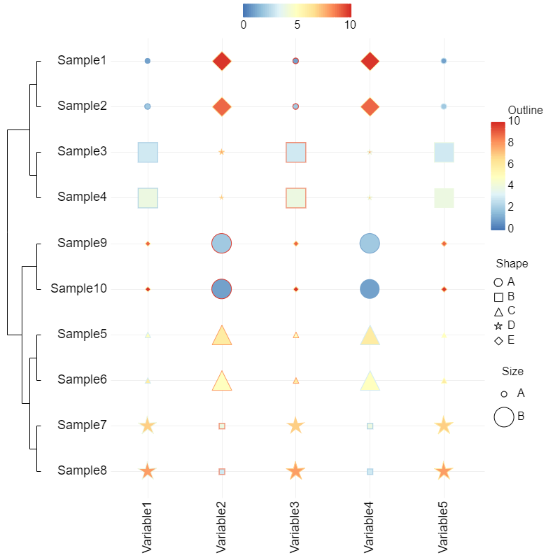
上图引入了 outline 、 shape 和 size 三个维度,所以和常见的热图并看起来不太一样,注释掉这三个变量就是常见的热图了。
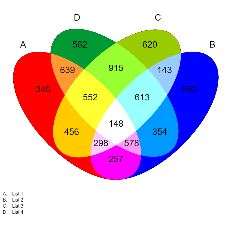
2.5 Venn图
rm(list = ls())
data <- data.frame(AC=456, A=340, ABC=552, ABCD=148, BC=915, ACD=298, BCD=613,
                   B=562, CD=143, ABD=578, C=620, D=592, AB=639, BD=354, AD=257)
canvasXpress(vennData   = data,
             graphType  = "Venn",
             vennLegend = list(A="List 1", D="List 4", C="List 3", B="List 2"),
             vennGroups = 4, # venn组数

             width      = 800,
             height     = 800)
2.6 网络图
rm(list = ls())
nodes=read.table("./data/cX-lesmiserable-nodes.txt", header=TRUE, sep="\t", quote="", fill=TRUE, check.names=FALSE, stringsAsFactors=FALSE)
edges=read.table("./data/cX-lesmiserable-edges.txt", header=TRUE, sep="\t", quote="", fill=TRUE, check.names=FALSE, stringsAsFactors=FALSE)
nodes$group1 <- paste('group',nodes$group,sep = '_')

canvasXpress(
  nodeData=nodes,
  edgeData=edges,
  colorNodeBy="group1", # node颜色

  shapeNodeBy="group1", # node形状

  colorSpectrum=list('#a6cee3','#1f78b4','#b2df8a','#33a02c','#fb9a99',
                     '#e31a1c','#fdbf6f','#ff7f00','#cab2d6','#6a3d9a'),
  graphType="Network",
  networkLayoutType="forceDirected",
  showAnimation=TRUE, # 显示构建的动画

  title="Les Miserable", # 标题

  width = 800,
  height = 800)
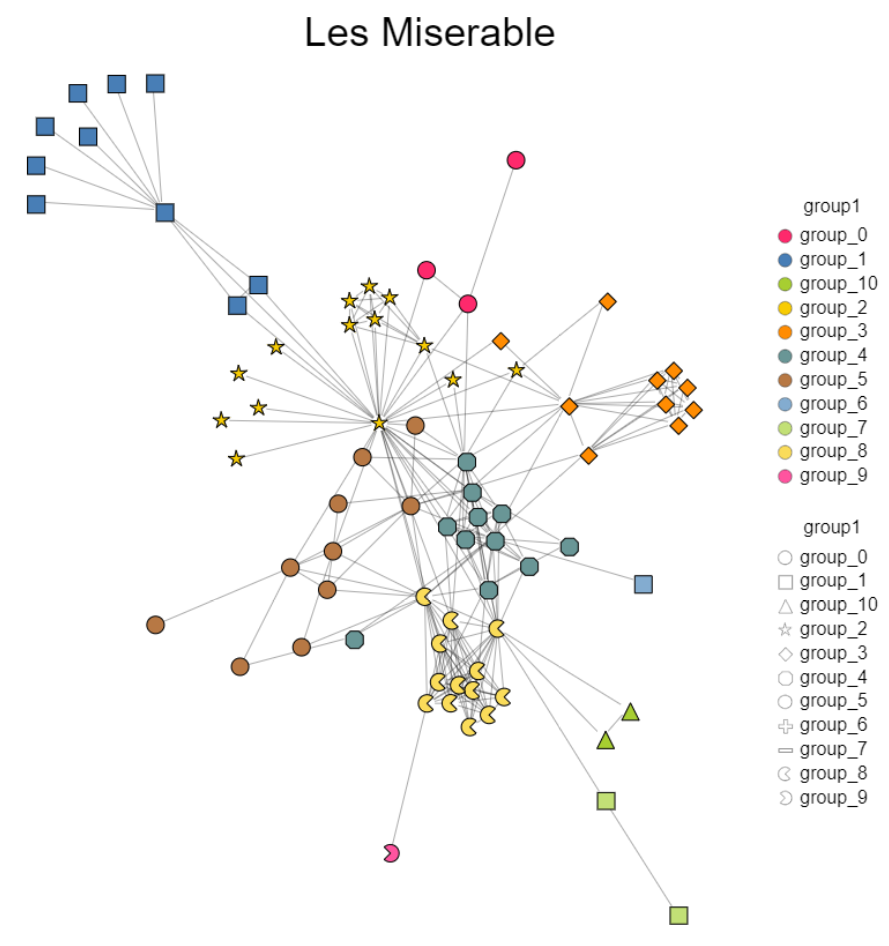
CanvasXpress 构建的网络图,对 node 位置进行调整比其他 R 包更为灵活,但是这个包的参数说明有点让人上头,比如指定 node 的颜色及形状还有 edge 相关的设置等我都没找到相关的参数说明,可能是因为我比较菜,反正就我目前这种情况,想要做一个更为灵活的网络图还是推荐 Cytoscape。
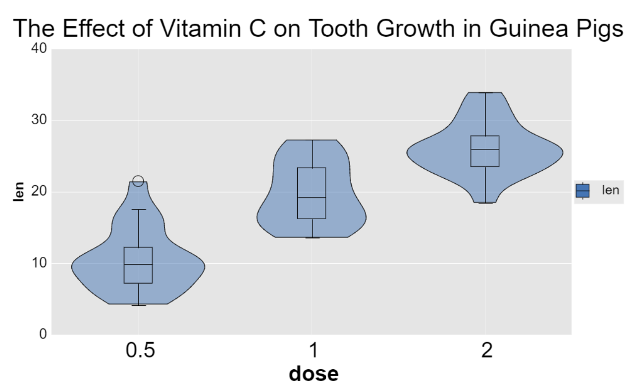
2.7 箱线图+小提琴图
rm(list = ls())
y=read.table("./data/cX-toothgrowth-dat.txt", header=TRUE, sep="\t", quote="", row.names=1, fill=TRUE, check.names=FALSE, stringsAsFactors=FALSE)
x=read.table("./data/cX-toothgrowth-smp.txt", header=TRUE, sep="\t", quote="", row.names=1, fill=TRUE, check.names=FALSE, stringsAsFactors=FALSE)

canvasXpress(
  data=y,
  smpAnnot=x,
  axisAlgorithm="rPretty", # 坐标轴break计算方式

  axisTickScaleFontFactor=1.8, # 坐标轴刻度尺寸

  axisTitleFontStyle="bold", # 坐标轴标题样式

  axisTitleScaleFontFactor=1.8, # 坐标轴标题尺寸

  background="white", # 背景颜色

  backgroundType="window",  # 背景类型

  backgroundWindow="#E5E5E5", # window背景颜色

  graphOrientation="vertical", # 图形方向

  graphType="Boxplot", # 图形种类

  groupingFactors=list("dose"), # 分组

  guides="solid", # 参考线类型

  guidesColor="white", # 参考线颜色

  showBoxplotIfViolin=T, # 显示legend

  showLegend=T, # 显示legend

  legendScaleFontFactor=1.8, # legend尺寸

  showViolinBoxplot=TRUE, # 显示小提琴图和箱线图

  smpLabelRotate=90, # 样本标签角度

  smpLabelScaleFontFactor=1.8, # 样本标签尺寸

  smpTitle="dose", # 样本标题

  smpTitleFontStyle="bold", # 样本标题样式

  smpTitleScaleFontFactor=1.8, # 样本标题尺寸

  theme="CanvasXpress", # 主题

  title="The Effect of Vitamin C on Tooth Growth in Guinea Pigs", # 标题

  violinScale="area",
  xAxis2Show=FALSE,
  xAxisMinorTicks=FALSE,
  xAxisTickColor="white",
  xAxisTitle="len",
  width=1000,
  height=600)
2.8 分面图
rm(list = ls())
y=read.table("./data/cX-generic-dat.txt", header=TRUE, sep="\t", quote="", row.names=1, fill=TRUE, check.names=FALSE, stringsAsFactors=FALSE)
x=read.table("./data/cX-generic-smp.txt", header=TRUE, sep="\t", quote="", row.names=1, fill=TRUE, check.names=FALSE, stringsAsFactors=FALSE)
z=read.table("./data/cX-generic-var.txt", header=TRUE, sep="\t", quote="", row.names=1, fill=TRUE, check.names=FALSE, stringsAsFactors=FALSE)

canvasXpress(
  data=y,
  smpAnnot=x,
  varAnnot=z,
  graphOrientation="vertical",
  graphType="Bar",
  layoutCollapse=FALSE,
  layoutType="rows",
  showTransition=FALSE,
  theme="CanvasXpress",
  afterRender=list(list("segregateVariables", list("Annt2")), list("segregateSamples", list("Factor1"))),
  width=1000,
  height=600)
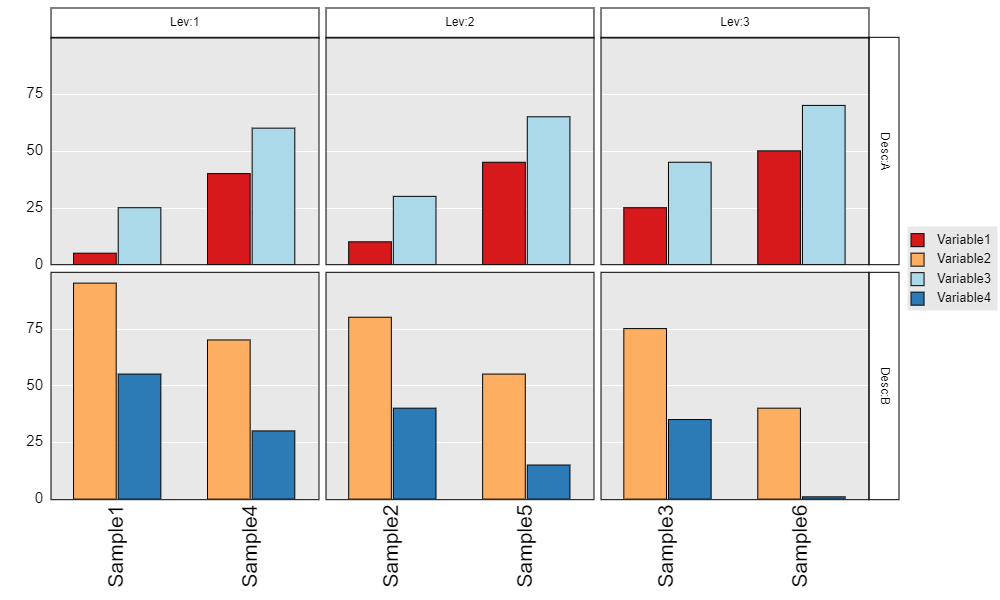
重点是观察数据结构和 afterRender 后的关系设置。
还有一个制作交互式图片的R包 recharts。其说明文档写的已经很详细了,故不再重复,链接见参考资料4。
参考资料:
1.neuhausi/canvasXpress
2.R语言交互式可视化包CanvasXpress
3.CanvasXpress
4.recharts: 百度ECharts 2的R语言接口