
Aplot拼图
本文主要记录了对 aplot 包学习的过程,作者原文见参考资料。
aplot 也是一个拼图的 R 包,在对齐图与图之间的坐标轴方面比 cowplot 和 patchwork 更好用。并且其内置有在主图的上下左右插入图片的四个函数,综上来看和 complexHeatmap 比较类似,均是通过对齐坐标来画出各种复杂的图形。
1.简单使用
p <- ggplot(mtcars, aes(mpg, disp)) + geom_point()
p2 <- ggplot(mtcars, aes(mpg)) +
  geom_density(fill='steelblue', alpha=.5) +
  theme_classic()

p3 <- ggplot(mtcars, aes(x=1, y=disp)) +
  geom_boxplot(fill='firebrick', alpha=.5) +
  theme_classic()

ap1 <- p %>%
  insert_top(p2, height=.3) %>%
  insert_right(p3, width=.1)

ap2 <- p %>%
  insert_top(p2+ggtree::theme_dendrogram(), height=.3) %>%
  insert_right(p3+theme_void(), width=.1)
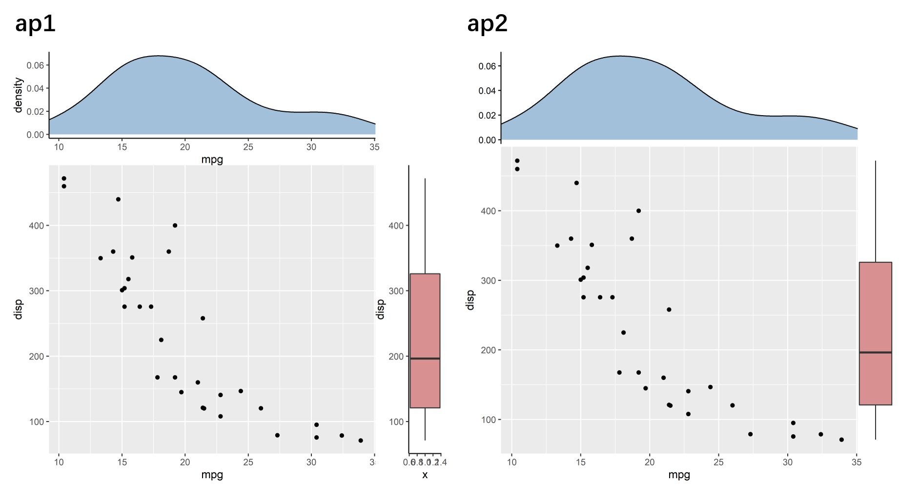
从 ap1 中可以直观的看出相对应的坐标轴是对齐的,再通过主题的修改获得 ap2 所示的拼图效果。
图形的保存使用 ggsave 函数。没有看错,和 ggplot2 中的名字和用法一模一样,十分方便。
ggsave(filename="ap1.png", plot=ap1, height = 6, width = 6, dpi = 600)
ggsave(filename="ap2.png", plot=ap2, height = 6, width = 6, dpi = 600)
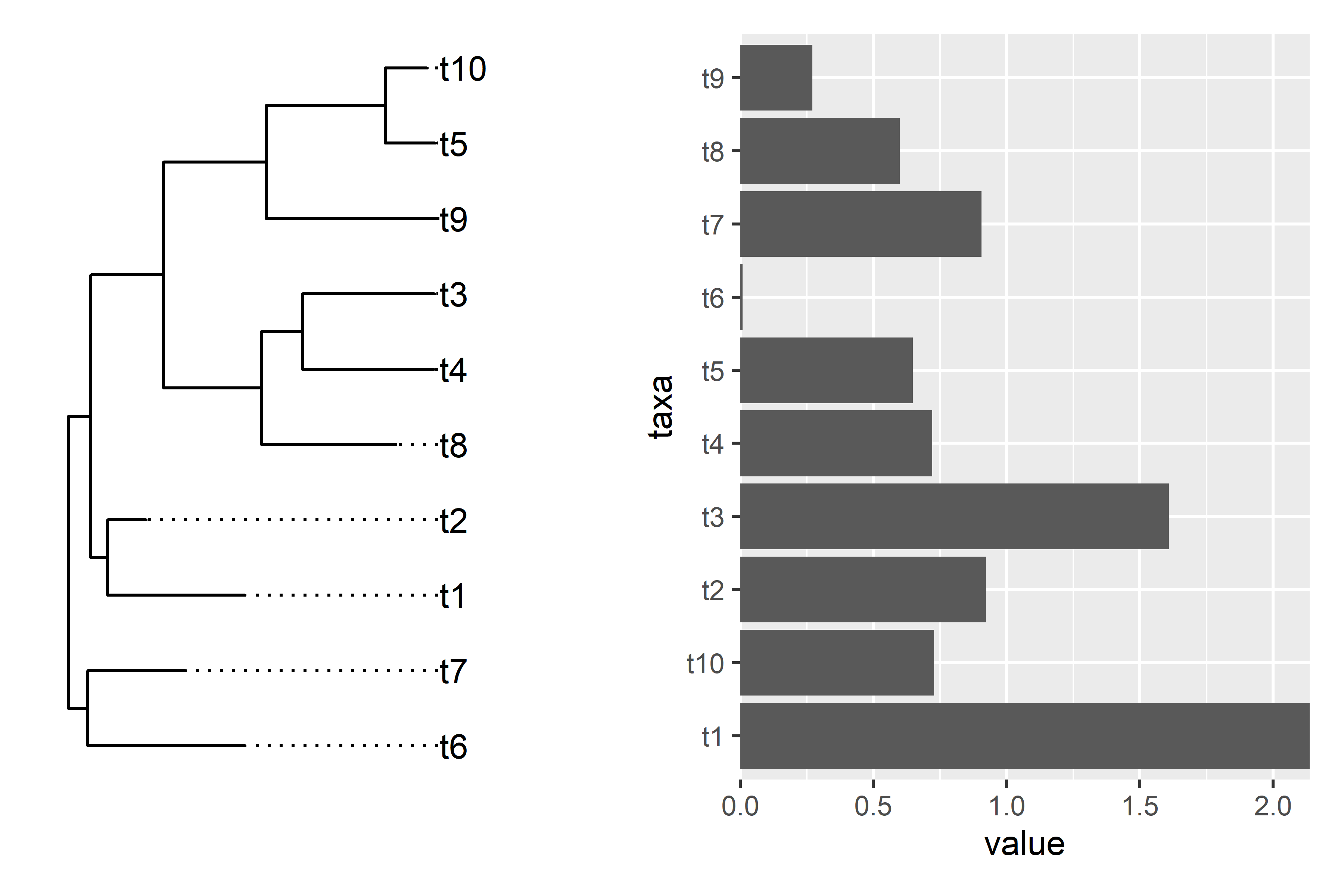
2.和进化树图关联
rm(list = ls())
library(ggtree)
set.seed(2020-08-26)
x <- rtree(10)
d <- data.frame(taxa=x$tip.label, value = abs(rnorm(10)))
p <- ggtree(x) + geom_tiplab(align = TRUE) + xlim(NA, 3)

library(ggstance)
p2 <- ggplot(d, aes(value, taxa)) + geom_colh() +
  scale_x_continuous(expand=c(0,0))
直接使用 patchwork 拼图,明显可见树图和柱状图并不匹配。
library(patchwork)
ap1 <- p | p2
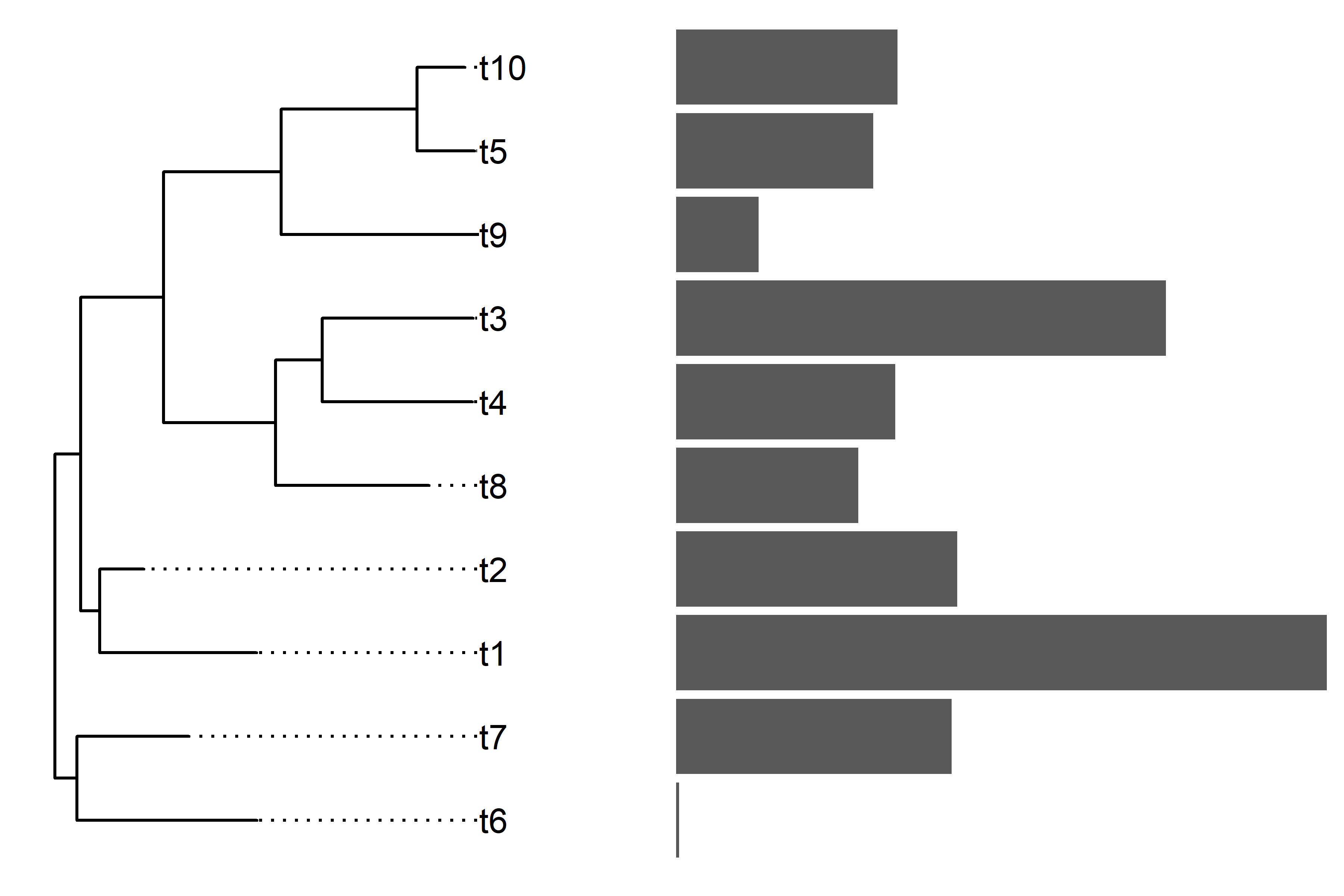
使用 aplot 拼图,轻松解决不匹配问题。
ap2 <- p2 %>% insert_left(p)
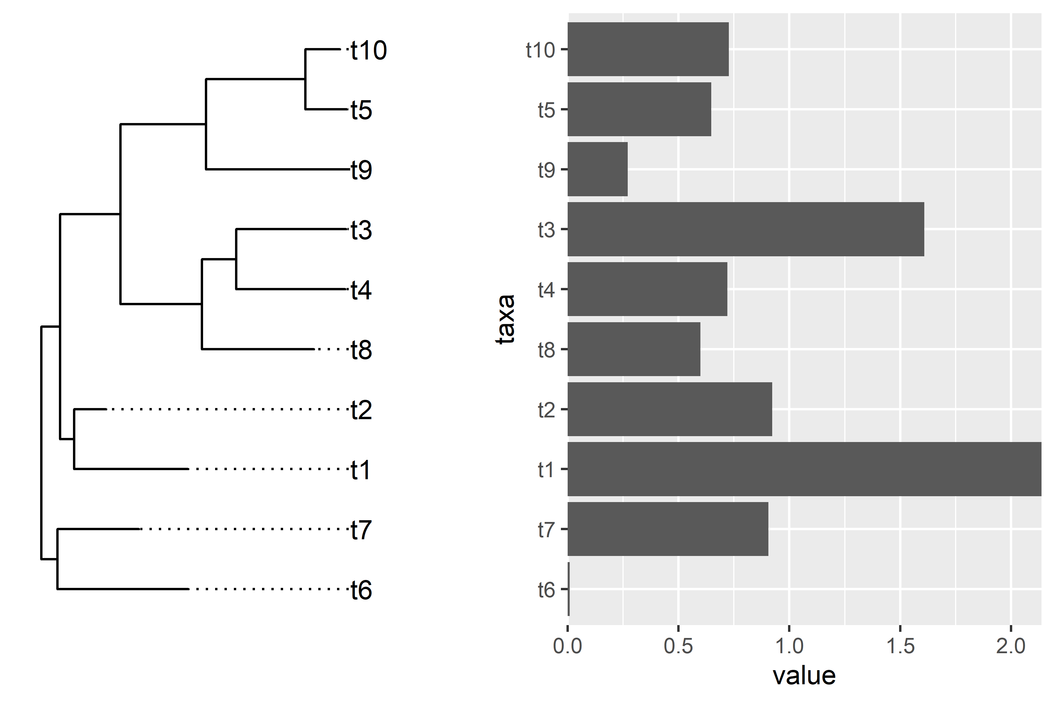
使用 aplot 拼图,并修改 p2 主题,使图形更加美观。
ap3 <- (p2+theme_void()) %>% insert_left(p)
3.单细胞气泡图
rm(list = ls())
library(readr)
library(tidyr)
library(dplyr)
library(ggplot2)
library(ggtree)

file <- system.file("extdata", "scRNA_dotplot_data.tsv.gz", package="aplot")
gene_cluster <- readr::read_tsv(file)

dot_plot <- gene_cluster %>%
  mutate(`% Expressing` = (cell_exp_ct/cell_ct) * 100) %>%
  filter(count > 0, `% Expressing` > 1) %>%
  ggplot(aes(x=cluster, y = Gene, color = count, size = `% Expressing`)) +
  geom_point() +
  cowplot::theme_cowplot() +
  theme(axis.line  = element_blank()) +
  theme(axis.text.x = element_text(angle = 90, vjust = 0.5, hjust=1)) +
  ylab(NULL) +
  theme(axis.ticks = element_blank()) +
  scale_color_gradientn(colours = viridis::viridis(20), limits = c(0,4), oob = scales::squish, name = 'log2 (count + 1)') +
  scale_y_discrete(position = "right")

mat <- gene_cluster %>%
  select(-cell_ct, -cell_exp_ct, -Group) %>%  # drop unused columns to faciliate widening

  pivot_wider(names_from = cluster, values_from = count) %>%
  data.frame() # make df as tibbles -> matrix annoying

row.names(mat) <- mat$Gene  # put gene in `row`

mat <- mat[,-1] #drop gene column as now in rows

clust <- hclust(dist(mat %>% as.matrix())) # hclust with distance matrix


ggtree_plot <- ggtree::ggtree(clust)

v_clust <- hclust(dist(mat %>% as.matrix() %>% t()))
ggtree_plot_col <- ggtree(v_clust) + layout_dendrogram()

labels= ggplot(gene_cluster, aes(cluster, y=1, fill=Group)) + geom_tile() +
  scale_fill_brewer(palette = 'Set1',name="Cell Type") +
  theme_void()
上面制作 ggtree_plot、dot_plot、ggtree_plot_col 和 labels 四个图形的代码还使很值得学习的。使用 patchwork 拼图只能达到下面效果了。
library(patchwork)
ggtree_plot | dot_plot | (ggtree_plot_col / labels)
而使用 aplot 可以轻松获得下图看起来高大上的图片。
ap2 <- dot_plot %>%
  insert_left(ggtree_plot, width=.2) %>%
  insert_top(labels, height=.02) %>%
  insert_top(ggtree_plot_col, height=.1)
参考资料:
1.aplot包:让你画出更复杂的图
2.拼图?我掐指一算,发现事情没那么简单!
3.YuLab-SMU/aplot
4.aplot online vignette