
博客细节配置
想要获得美观的博客界面,最快的方式是先选择主题,然后根据主题的说明进行配置,大神请无视。本文主要记录了我配置 hugo-tranquilpeak-theme 的过程及 md 文档的一些特殊语法。
1.修改 config.toml 文件
能看本文的,一定会换 Hugo 的主题了,所以不再赘述更换主题的操作。
themes/hugo-tranquilpeak-theme/exampleSite 目录下有 config.toml 文件,此文件就是该主题的配置文件,可以直接用该文件覆盖 themes 同一目录下的 config.toml 文件,然后再对覆盖后的文件进行修改,该主题的配置文档里面的说明非常详细,所以我只记录我配置的那些部分。
1.1 修改头像
没有自己个性化的头像的博客死没有灵魂的。该主题默认使用邮箱里面的头像,邮箱无效才会使用 picture后面的图片链接。这样并不方便,会降低头像的加载速度,而是很有可能头像加载成邮箱的 logo,别问我是怎么知道的。
针对上述问题,我直接将 gravatarEmail 这行直接注释掉,直接使用图片链接作为头像。
[author]
  name = "Firstname Lastname"
  bio = "Super bio with markdown support **COOL**"
  job = "Your job title"
  location = "France"
  # Your Gravatar email. Overwrite `author.picture` everywhere in the blog
  gravatarEmail = "thibaud.lepretre@gmail.com"
  # Your profile picture
  # Overwritten by your gravatar image if `author.gravatarEmail` is filled
  picture = "https://cdn1.iconfinder.com/data/icons/ninja-things-1/1772/ninja-simple-512.png"
  # Your Twitter username without the @. E.g : thibaudlepretre
  # twitter = "thibaudlepretre"
  # Your google plus profile id. E.g : +ThibaudLepretre or 114625208755123718311
  # googlePlus = "+ThibaudLepretre"
1.2 切换不同宽度的侧边
[params] 中有如下参数,提供了6种方案供大家选择,每个方案也有简单说明,最直观的方式是把全部方案换一遍,再根据喜好选择。个人选择的是 2号方案。
  # Customization
  # Define the behavior of the sidebar
  # 1: Display extra large sidebar on extra large screen, large sidebar on large screen,
  #    medium sidebar on medium screen and header bar on small screen and
  # extra large sidebar is swiped on extra large screen and large sidebar on all lower screen (default)
  # 2: Display large sidebar on large screen, medium sidebar on medium screen and
  #    header bar on small screen and large sidebar is swiped
  # 3: Display medium sidebar on large and medium screen and header bar on small screen and
  #    medium sidebar is swiped
  # 4: Display header bar on all screens, extra large sidebar is swiped on extra large screen and
  #    large sidebar is swiped on all lower screens
  # 5: Display header bar on all screens and large sidebar is swiped on large screen
  # 6: Display header bar on all screens and medium sidebar is swiped
  sidebarBehavior = 1
1.3 菜单栏的设置
menu 中包含三类 [[menu.main]]、[[menu.links]]和[[menu.misc]] ,三种格式均如下所示。
[[menu.main]]
  weight = 2
  identifier = "categories"
  name = "Categories"
  pre = "<i class=\"sidebar-button-icon fa fa-lg fa-bookmark\"></i>"
  url = "/categories"
- weight: 个人理解为顺序,排序作用
- url: 路径或链接
- pre: 图标
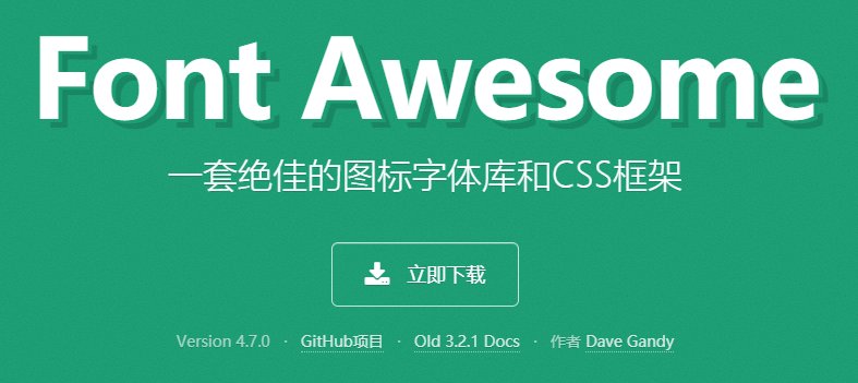
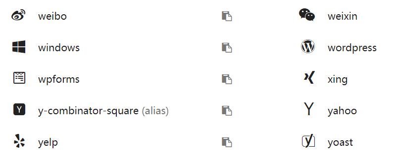
在此主要想说的是 pre 参数,对于网页制作的人员可能比较简单,但是作为小白的我一脸无奈,好在万能的谷歌让我搜出了一个神奇的网站: Font Awesome。
Font Awesome 首页如下,不但提供了大量的图标,而且用法十分简单,直接改名字就可以愉快使用。当然也有其他有趣的用法,感兴趣的可以研究一下,本人只需要修改图标。
1.4 侧边图片设置
将图片置于 themes/hugo-tranquilpeak-theme/static/images目录下,然后修改 [params] 中的 coverImage 参数后的图片名称即可。
  # Your blog cover picture. I STRONGLY recommend you to use a CDN to speed up loading of pages.
  # There is many free CDN like Cloudinary or you can also use indirectly
  # by using services like Google Photos.
  # Current image is on AWS S3 and delivered by AWS CloudFront.
  # Otherwise put your image, for example `cover.jpg` in folder `static/images/`,
  # and use relative url : `images/cover.jpg`
  coverImage = "images/cover.jpg"
1.5 文末链接
[params]还有如下所示的参数,这是设置文末友情链接的地方。
  [[params.sharingOptions]]
    name = "Twitter"
    icon = "fa-twitter"
    url = "https://twitter.com/intent/tweet?text=%s"
2. md文档编写的特殊格式
2.1 博文分类
将博文进行分类是一个良好的习惯。主题中提供了下面几种分类方式,以便于更好的管理博文,在 config.toml 文件中添加后即可在 md 文档中使用相应格式来实现分类。
[taxonomies]
  tag = "tags"
  category = "categories"
  archive = "archives"
下面是使用分类并且设置博文封面的 md 文档模板。
---
title: "Example paper"
thumbnailImagePosition: left
thumbnailImage: //d1u9biwaxjngwg.cloudfront.net/cover-image-showcase/city-750.jpg
coverImage: //d1u9biwaxjngwg.cloudfront.net/cover-image-showcase/city.jpg
metaAlignment: center
coverMeta: out
date: 2015-05-13
categories:
- tranquilpeak
- features
tags:
- cover image
---
直接修改并观察变化是最直观的方式,所以在此就不做说明了,直接放两张图感受一下。
2.1 设置标题目录界面预览博文
细心的小伙伴会发现上图每个标题下面展示的博文内容比较少,而不像自己标题下方展示了大段的博文,而显得目录界面不够简洁。
实现上述需求非常简单,md 文档中使用下面语句作为分隔,该语句上方的内容将成为预览,并且在阅读全文时,并不会丢失上方的部分。
<!--more-->
以上就是我在配置细节方面及文档编写过程中做的一些记录,后续若有修改,会持续更新,最后提一点,在参考资料中可以查阅如何设置评论的相关操作。
参考资料:
1.Configure Hugo
2.第七讲:使用Hugo引擎搭建超快的博客
3.Hugo博客搭建系列文章
4.用 Hugo 配合 Valine 实现简洁的评论交互
5.『手把手』在 HUGO 中添加 Valine 评论系统的过程
6.Font Awesome